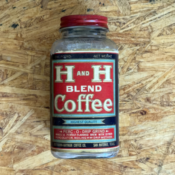
A Clean Second Example of the H and H High Grade Three-Pound Tin
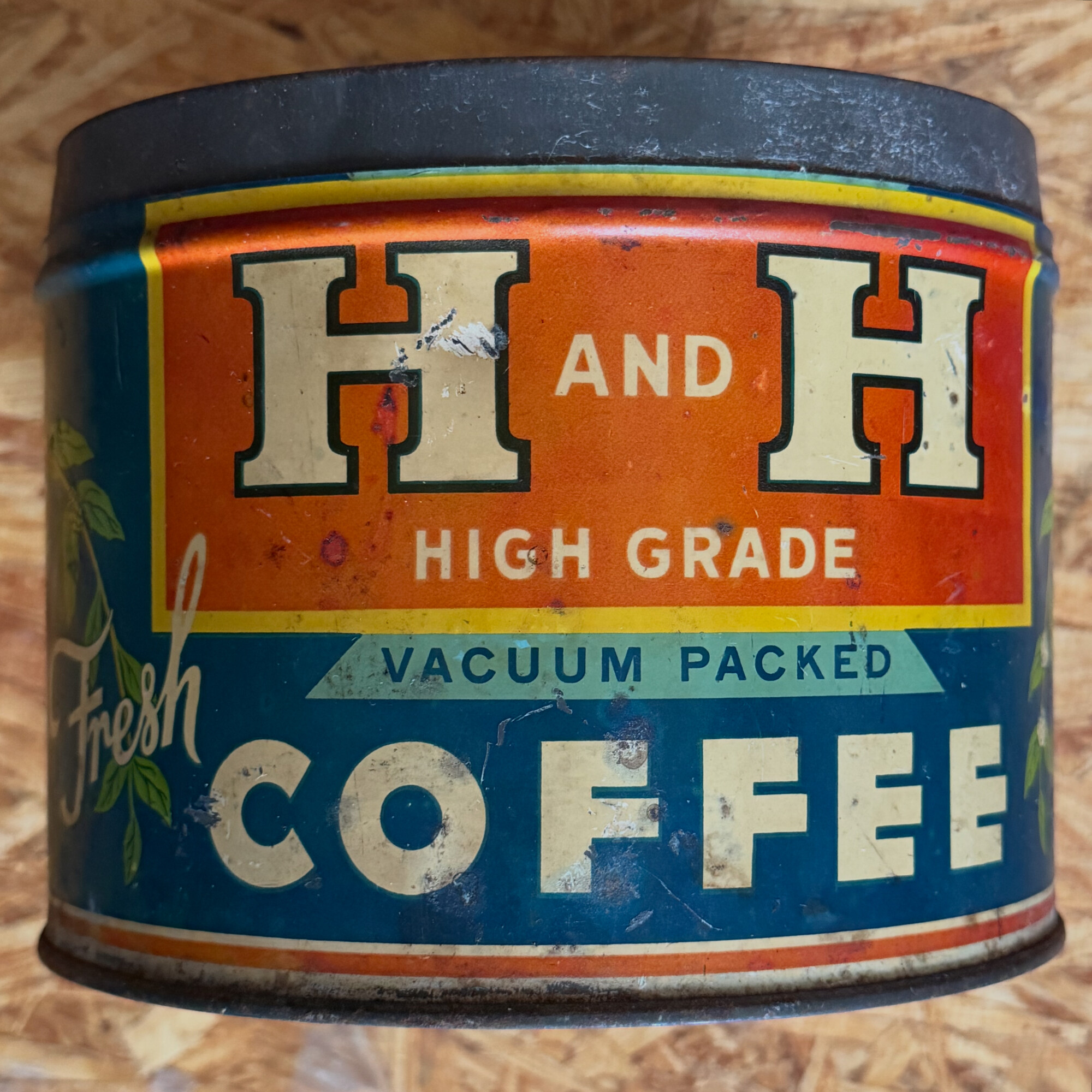
A clean second example of the H and H High Grade three-pound tin already on the shelf. The 2015 acquisition came from a San Antonio eBay seller and arrived missing its lid, with rust blooms around the VACUUM PACKED banner and the top rim scraped down to bare metal. This new specimen — photographed on the same workshop OSB chipboard benchtop as the 2026-04-23 keywind second-example — is also without a lid, but the body litho and metal are in much better shape: orange and navy read at full saturation, with only light handling scuffs, not the heavy weathering of the 2015 can.
On the workbench: The same OSB (oriented-strand board) chipboard used in the keywind second-example post from the same day — a practical workshop surface, and a small San Antonio connection: the engineer Armin Elmendorf (8 September 1890, San Antonio), whose wafer / oriented-strand work is in the story of how OSB became a building product. The Collection gallery page spells out that choice in a bit more detail.
Size — orange panel, not red
The tin’s center panel is orange, and that’s the feature that tells you this is the three-pound variant rather than the one-pound. The collection’s one-pound High Grade tins — the 2014 battered acquisition, the 2017-03 Instagram photo, and the 2017-08 one-pound with matching lid — all carry a red center panel. The three-pound uses the same graphic language but re-pigmented in orange, a detail first noted on the 2015 three-pound post (“The orange is either faded red sections or a new color to make this tin stand out. Larger tin?”). Seeing a second three-pound specimen with the orange panel still vivid and unfaded confirms that the orange was deliberate color variant for the larger size, not a red that aged off.
What’s on the tin
Front face, top to bottom:
- Orange center panel framed by a yellow double-line border, carrying ‘H AND H’ in tall cream-white serif block capitals with a navy-black double-outline / drop-shadow and a small cream-on-orange ‘AND’ ligature centered between the two H’s, and ‘HIGH GRADE’ in cream-white serif capitals on a second line below.
- A teal/aqua pennant-ribbon banner edged in darker navy carrying ‘VACUUM PACKED’ in navy-blue serif capitals, set just below the orange panel.
- ‘Fresh’ in white cursive script at the lower left with a red drop-shadow flourish, and ‘COFFEE’ running wide across the deep-navy main field in massive cream-white serif block capitals with navy-black outlines.
- A green coffee-plant branch with paired leaves and small red cherries on the left flank (and, by design symmetry, a matching branch on the right flank off-frame).
- Along the base, a narrow orange horizontal band and a red pinstripe close the label out.
Top of the can: the original press-fit closure is not present — the photograph shows the can open to a rolled or crimped metal rim and shadowed interior, the same lid missing condition as the 2015 three-pound tin, not a sealed cap. What would have sat here was a plain flat press-fit cap like the one still present on the 2017-08 one-pound with matching lid (that smaller tin’s lid even carries a decorative cream-and-red rim stripe; three-pound examples may have shipped with plainer caps — we do not have an intact three-pound top to show).
Why this matters
The 2015 three-pound High Grade was, until now, the only three-pound specimen of this design in the collection — and it arrived heavily weathered and lidless, which made the orange-versus-red color question and the full lettering hard to read in places. This second can is also missing its lid, so we still do not have a closed three-pound High Grade in the documentation — for that general idea of an intact can, the one-pound line still has the 2014 battered one-pound and the 2017 one-pound with matching lid. What this 2026 frame does add is a clean body in the same three-pound orange design: a readable reference for every line and band when someone is trying to match a find against the project.
Two examples of the same three-pound tin, both lidless but at opposite ends of the condition curve (rough 2015 versus clean 2026) — a bracket for identification even without the rare intact lid.